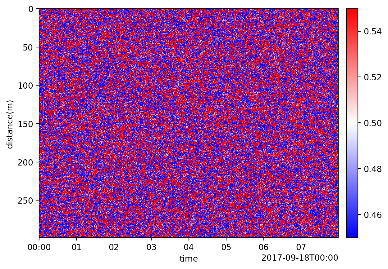
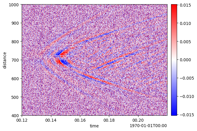
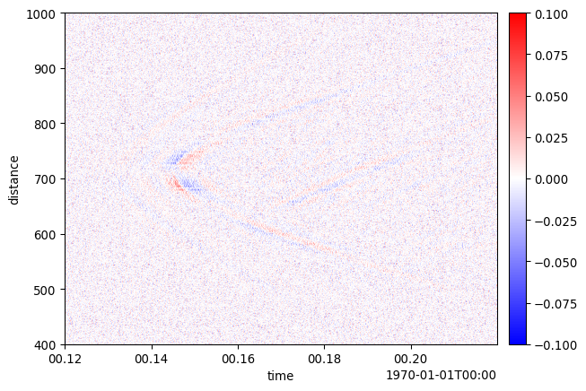
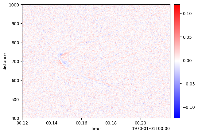
Evenly sampled dimension coordinates are rendered with imshow for efficient display and image interpolation. Finite, monotonic irregular coordinates are rendered with pcolormesh so cell geometry follows the coordinate values. Incomplete or nonmonotonic coordinates fall back to imshow with index-based or minimum/maximum extents.
Parameters
Parameter
Description
patch
The Patch object.
ax
A matplotlib object, if None create one.
cmap
A matplotlib colormap string or instance. If None, a colormap will be chosen automatically, depending on the data_type of the patch.
scale
If not None, controls the saturation level of the colorbar. Values can either be a float, to set upper and lower limit to the same value centered around the mean of the data, a length 2 tuple specifying upper and lower limits, or None, which will automatically determine limits based on a quartile fence. (uses q1 - 1.5 * (q3 - q1) and q3 + 1.5 * (q3 - q1)).
scale_type
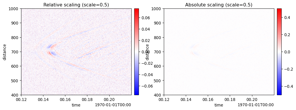
Controls the type of scaling specified by scale parameter. Options are: relative - scale based on half the dynamic range in patch absolute - scale based on absolute values provided to scale
interpolation
A value fed to matplotlib’s imshow to handle downsampling large arrays, which is relevant for DAS. Usually, “antialiased” works well, but if the data look smeared disabling interpolation with None might help. Other options are available, see matplotlib’s documentation for more details. This option does not apply when irregular coordinates select the pcolormesh renderer.
interpolation_stage
If ‘data’, interpolation is carried out on the data provided by the user. If ‘rgba’, the interpolation is carried out after the colormapping has been applied (visual interpolation). ‘auto’ (default) selects a suitable interpolation stage automatically. See matplotlib’s imshow documentation for more details. This option does not apply when pcolormesh is used.
gap_color
Matplotlib color used to display gaps in irregular dimension coordinates. When a color is provided, a masked row or column is inserted for each detected gap and displayed with this color. The default of None bridges gaps by extending adjacent cells across them without expanding the data matrix. This option only applies when pcolormesh is used. Existing masked or NaN data receive the same color as coordinate gaps.
gap_factor
When gap_color is provided, coordinate intervals larger than this factor times the median interval are displayed as gaps. With the default gap_color=None, cells bridge intervals and this parameter has no visual effect. Gap detection assumes the median interval represents the sampling interval, so coordinates containing contiguous regions with different sampling rates may classify the more coarsely sampled region as gaps. For such data, use the default gap_color=None, increase gap_factor, or plot/resample the regions separately. Must be greater than 1.
log
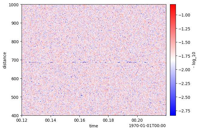
If True, visualize the common logarithm of the absolute values of patch data. To avoid log(0), the abs(array) is cast to float64 and a small value added.
cbar
If True, plot the colorbar, else do not. This controls only colorbar display; use cmap to control colormap selection.
show
If True, show the plot, else just return axis.
Examples
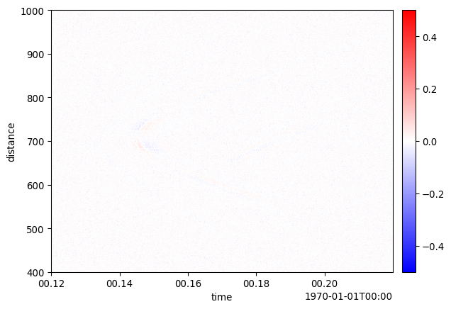
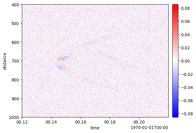
# Plot with default scaling (uses 1.5*IQR fence to exclude outliers)import dascore as dcfrom dascore.units import percentpatch = dc.get_example_patch("example_event_1").normalize("time")_ = patch.viz.waterfall()# Use relative scaling with a tuple to show a specific fraction# of data range. Scale values of (0.1, 0.9) map to 10% and 90%# of the data's [min, max] range_ = patch.viz.waterfall(scale=0.1, scale_type="relative")# Likewise, percent units can be used for additional clarity_ = patch.viz.waterfall(scale=10*percent, scale_type="absolute")# Use relative scaling with a tuple to show the middle 80% of data range# Scale values of (0.1, 0.9) map to 10% and 90% of [data_min, data_max]_ = patch.viz.waterfall(scale=(0.1, 0.9), scale_type="relative")# Use absolute scaling to set specific colorbar limits# This directly sets the colorbar limits to [-0.5, 0.5]_ = patch.viz.waterfall(scale=(-0.5, 0.5), scale_type="absolute")# Visualize data on a logarithmic scale# Useful for data spanning multiple orders of magnitude_ = patch.viz.waterfall(log=True)# Compare scale types: relative vs absoluteimport matplotlib.pyplot as pltfig, (ax1, ax2) = plt.subplots(1, 2, figsize=(12, 4))# Relative: 0.5 means ±50% of dynamic range around mean_ = patch.viz.waterfall(scale=0.5, scale_type="relative", ax=ax1)_ = ax1.set_title("Relative scaling (scale=0.5)")# Absolute: 0.5 means colorbar limits are [-0.5, 0.5]_ = patch.viz.waterfall(scale=0.5, scale_type="absolute", ax=ax2)_ = ax2.set_title("Absolute scaling (scale=0.5)")# Undo Y axis inversion which occurs when time is on the Yax = patch.viz.waterfall()ax.invert_yaxis()
Note
The Y axis is automatically inverted if it is “time-like”. This is to be consistent with standard seismic plotting convention. If you don’t want this, simply invert the y axis of the returned axis object as shown in the example section.
Changes to default scale behavior: Until DASCore version 0.1.13, the default behavior when scale=None was to scale along the entire range of the data. However, very often in real data a few anomalously large or small values would obscure most of the patch details. In version 0.1.13 the default behavior is to now use a statistical fence to avoid the problem. To get the old behavior, simply set scale=1.0.