import dascore as dc

patch = dc.get_example_patch('example_event_2')

# Default scaling uses IQR-based fence to handle outliers
patch.viz.waterfall(show=True)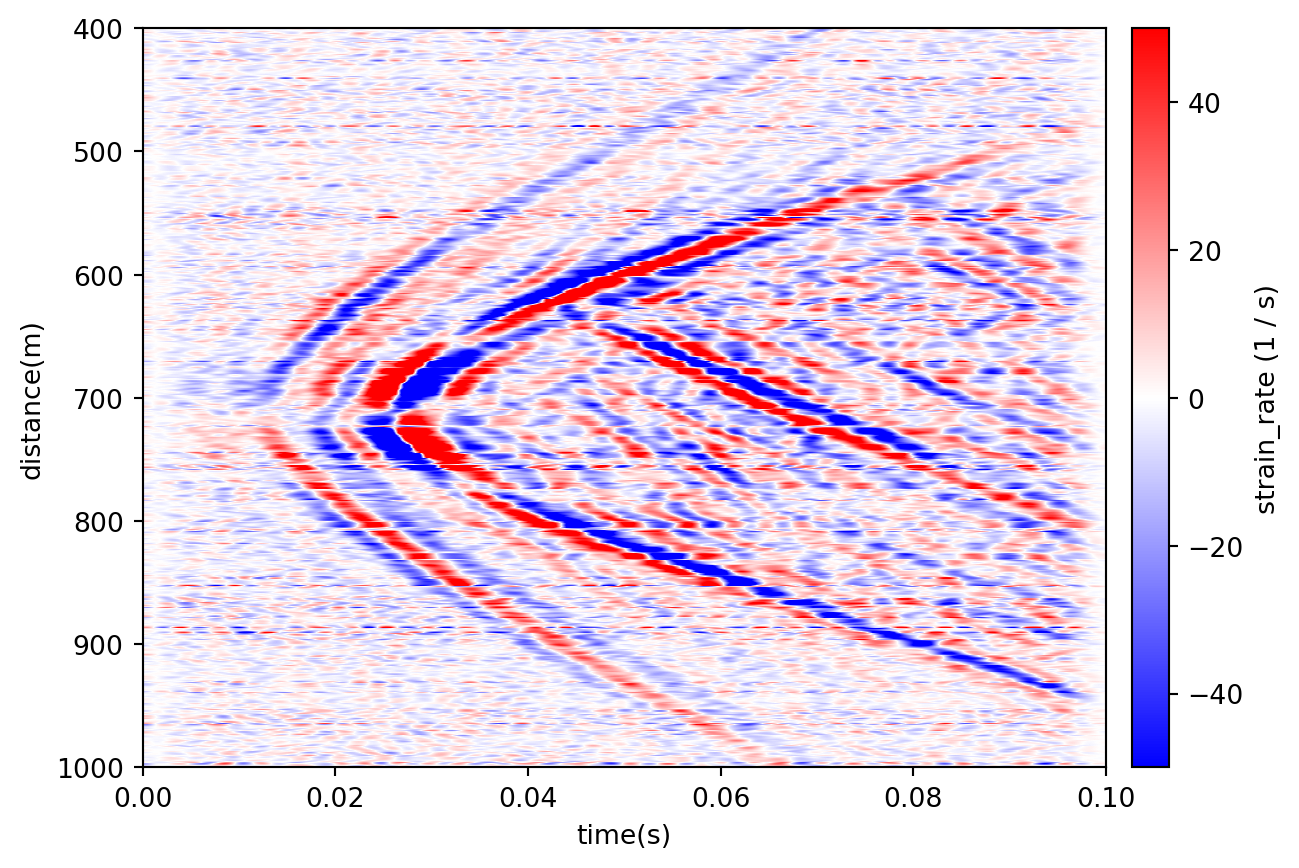
<Axes: xlabel='Time [s]', ylabel='Distance [m]'>The following provides some examples of patch visualization. See the viz module documentation for a list of visualization functions
The waterfall patch function creates a waterfall plot of the patch data.
import dascore as dc
patch = dc.get_example_patch('example_event_2')
# Default scaling uses IQR-based fence to handle outliers
patch.viz.waterfall(show=True)
<Axes: xlabel='Time [s]', ylabel='Distance [m]'>The scale parameter controls the colorbar saturation. By default, waterfall uses a statistical fence (1.5×IQR) to exclude outliers and show the majority of the data clearly.
import matplotlib.pyplot as plt
import dascore as dc

patch = dc.get_example_patch('example_event_2')

fig, (ax1, ax2) = plt.subplots(1, 2, figsize=(12, 4))

# Relative scaling: 0.2 means ±20% of dynamic range around mean
patch.viz.waterfall(scale=0.2, scale_type="relative", ax=ax1)
ax1.set_title("Relative scaling (scale=0.2)")

# Absolute scaling: directly set colorbar limits
patch.viz.waterfall(scale=(-50, 50), scale_type="absolute", ax=ax2)
ax2.set_title("Absolute scaling (scale=(-50, 50))")

plt.tight_layout()
plt.show()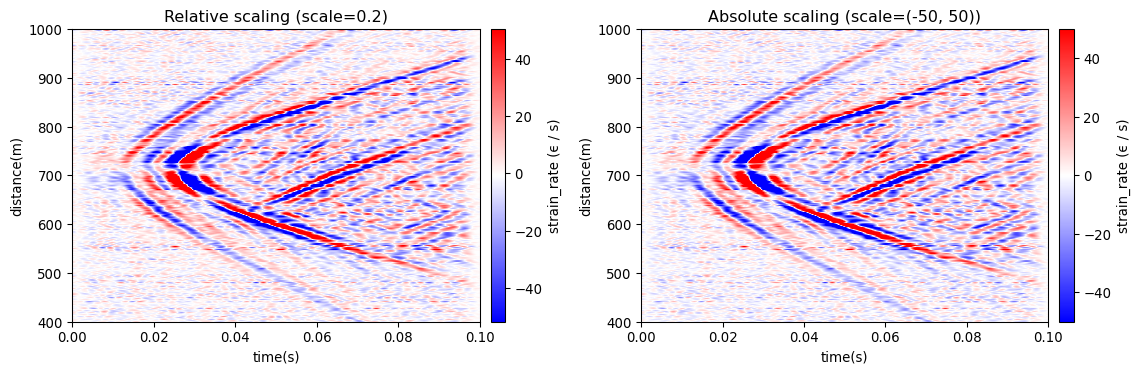
The wiggle patch function creates a wiggle plot of the patch data. We’ll use the same patch as above to model this function.
import dascore as dc

patch = (
    dc.get_example_patch('example_event_1')
    .set_units("mm/(m*s)", distance='m', time='s')
    .taper(time=0.05)
    .pass_filter(time=(None, 300))
)
patch.viz.wiggle(scale = .5)
<Axes: xlabel='Time', ylabel='Distance [m]'>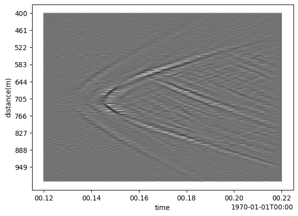
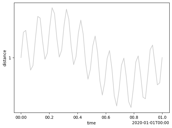
Another example using wiggle to plot a sine wave is demonstrated below.
import dascore as dc

patch = dc.examples.get_example_patch(
    "sin_wav",
    sample_rate=60,
    frequency=[60, 10],
    channel_count=1,
)
patch.viz.wiggle(show=True);